The Power of Infographic Newsletters: Turning Complex Data into Actionable Insights
In an era where inboxes are flooded and attention spans are shrinking, marketers and creators face a persistent challenge: how to communicate essential information quickly, clearly, and memorably. Enter the infographic newsletter—a hybrid approach that blends the storytelling potential of email marketing with the visual punch of infographics. This strategy isn’t just about looking good; it’s about making complex data understandable and driving recipients to action.
This article will explore why infographic newsletters are becoming a game-changer for brands and creators, how to design them for maximum impact, and what the numbers say about their effectiveness. We’ll also look at real-world examples and offer actionable tips for integrating this approach into your own campaigns.
Why Infographic Newsletters Matter in Modern Email Marketing
With over 347.3 billion emails sent and received each day worldwide in 2023 (Statista), standing out in the inbox is harder than ever. Traditional text-heavy newsletters often fail to engage recipients, leading to low open and click-through rates. Visual communication has become essential. Studies show that people process images 60,000 times faster than text, and 90% of information transmitted to the brain is visual (Thermopylae Sciences + Technology).
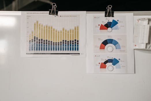
.png)
Infographics harness this power by transforming raw data and complex concepts into visually compelling stories. When integrated into newsletters, they don’t just inform—they inspire action. According to HubSpot, infographics can increase web traffic by up to 12% and are shared on social media three times more than any other type of content. In the context of email marketing, these benefits translate to higher engagement, better retention, and more meaningful interactions.
Key Elements of Effective Infographic Newsletters
Not all infographic newsletters are created equal. To unlock their full potential, it’s crucial to focus on a few core elements:
1. $1 The best infographics distill information into clear visuals. Avoid clutter and keep your message focused. Each piece of data should serve a clear purpose. 2. $1 Guide readers’ eyes with strategic use of color, size, and layout. Emphasize the most important stats or insights first. 3. $1 Use your brand’s color palette, fonts, and logo to ensure recognition and trust. 4. $1 Every infographic newsletter should have a clear call-to-action (CTA), whether it’s visiting a landing page, downloading a resource, or sharing the content. 5. $1 Ensure your designs are mobile-friendly. Over 45% of email opens occur on mobile devices (Litmus, 2023).Let’s compare standard text newsletters to infographic newsletters to see how these elements make a difference:
| Feature | Text Newsletter | Infographic Newsletter |
|---|---|---|
| Average Click-Through Rate | 2.6% (Campaign Monitor) | 4.2% (Venngage) |
| Information Retention | 10% after 3 days | 65% after 3 days (Brain Rules) |
| Shareability | Low | 3x higher (HubSpot) |
| Mobile Readability | Variable | High (with responsive design) |
Design Strategies for Impactful Infographic Newsletters
Creating an infographic newsletter requires more than simply pasting a chart into an email. Here are some design strategies to maximize engagement:
- $1 Start your newsletter with an eye-catching graphic or data point. This draws readers in and encourages them to keep scrolling. - $1 Frame your information as a narrative. For example, instead of listing quarterly sales figures, show a timeline with key milestones and pivotal moments. - $1 Break content into digestible sections using icons, color blocks, or numbered steps. This makes complex data less intimidating and easier to scan. - $1 Use bold fonts, contrasting colors, or call-out boxes to emphasize the most important numbers or insights. - $1 Subtle GIFs or animated elements can add movement and draw attention, but be mindful of loading times and compatibility. - $1 Use alt text for images, high-contrast colors, and legible fonts to ensure your newsletter is usable for all recipients.Real-World Success Stories: Infographic Newsletters in Action
Many organizations have seen measurable success with infographic newsletters. Here are a few examples:
- $1 regularly sends impact reports to donors using infographic-driven emails. By visually illustrating how donations fund clean water projects, they’ve achieved a donor retention rate of over 60% (compared to the nonprofit industry average of 45%). - $1’s annual “Wrapped” campaign delivers personalized music stats to users in a visually rich, infographic-style email. In 2022, this campaign generated over 60 million shares on social media and significantly boosted app engagement in December. - $1 often uses infographic newsletters to explain complex news stories or data-driven investigations. For instance, their COVID-19 tracking emails achieved double the average open rate by summarizing key trends in easy-to-understand visuals.These cases highlight two key advantages: improved comprehension and increased sharing. When readers instantly understand the value or insight, they’re more likely to act on it—and tell others.
Practical Tips for Marketers and Creators Using Infographic Newsletters
Ready to get started? Here are step-by-step tips for building your own infographic newsletters:
1. $1 Are you trying to educate, persuade, or drive a specific action? Let your objective guide your content and design choices. 2. $1 Platforms like Canva, Venngage, and Piktochart offer easy-to-use templates for infographics. For more customized designs, Adobe Illustrator or Figma are powerful options. 3. $1 Focus on 2–4 key insights per newsletter. Too much data can overwhelm readers. 4. $1 Use A/B testing to experiment with different layouts, visuals, and CTAs. Track open, click, and share rates to see what resonates. 5. $1 Personalize infographics when possible. For example, send customers a visual summary of their activity or achievements. 6. $1 Make it easy for readers to share your infographic on social media or forward your newsletter to colleagues.The Future of Email: Infographic Newsletters and Beyond
As attention becomes the scarcest commodity in digital marketing, the demand for clear, compelling communication will only grow. Infographic newsletters are leading the way, bridging the gap between data and decision-making for busy audiences. With advances in design tools and email technology, expect to see even more interactive and personalized infographic emails in the coming years.
For marketers and creators, now is the time to experiment with this format. Not only can it improve your email metrics, but it can also deepen your relationship with your audience—by making your insights easy to understand, act on, and share.