The Science Behind Visual Storytelling in Email Marketing: How the Brain Processes Your Message
Email marketing is undergoing a vibrant transformation, fueled by the power of visual storytelling. While marketers and creators know that visuals grab attention, fewer understand the underlying science that makes images, infographics, and data-driven visuals so effective in delivering messages. Diving into the cognitive mechanisms and psychological principles behind visual storytelling can help you craft emails that not only catch the eye but also embed your message deeper and drive action.
In this article, we’ll explore how the human brain processes visuals in email marketing, why this matters for engagement and retention, and actionable ways to leverage these scientific insights for your campaigns.
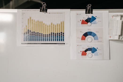
.png)
How the Brain Processes Visual Information in Emails
The human brain is hardwired to respond to visuals. In fact, research shows that 90% of the information transmitted to the brain is visual, and visuals are processed 60,000 times faster than text. When an email lands in a recipient’s inbox, the brain immediately scans for visual cues to determine relevance and interest.
When a subscriber opens an email, here’s what happens: - The visual cortex, which occupies about 30% of the brain’s cortex, begins interpreting images, colors, and layouts within milliseconds. - The amygdala, a key player in emotional processing, reacts to visual stimuli, influencing whether the content feels engaging, trustworthy, or ignorable. - The brain’s pattern recognition capabilities allow users to quickly understand infographics, icons, and charts, often before reading any accompanying text.This rapid processing is why emails featuring compelling visuals consistently outperform those relying solely on text. According to a 2023 HubSpot survey, emails with visuals have an average open rate of 27%, compared to 18% for text-only emails.
Why Visual Storytelling Enhances Memory and Recall
Visual storytelling goes beyond simply adding images—it’s about using visuals to convey a narrative or data in a memorable way. The “Picture Superiority Effect” is a well-documented phenomenon: people remember 65% of information when it’s paired with a relevant visual, compared to just 10% for text alone after three days.
Why does this happen? - Dual-coding theory suggests the brain stores information using both verbal and visual channels, making recall more robust. - Visual metaphors and infographics help chunk complex data into digestible, memorable pieces. - Story-driven visuals (like a step-by-step infographic journey) activate multiple regions of the brain, enhancing emotional connection and long-term memory.For example, a SaaS company emailing a product update might use a timeline infographic. Recipients not only see the chronological feature rollouts but also remember key milestones because the visuals map the story in their minds.
The Impact of Visual Hierarchy and Layout in Email Design
Humans are natural pattern-seekers. The layout of an email—where images, headlines, and calls to action (CTAs) are placed—guides the recipient’s attention and comprehension. Eye-tracking studies, such as those by Nielsen Norman Group, reveal that users typically scan emails in an “F-pattern,” focusing first on the top and left sections.
Effective visual hierarchy can: - Direct attention to the most important message or CTA. - Reduce cognitive load, making emails easier and faster to process. - Improve click-through rates: Campaign Monitor reports that emails with a clear visual hierarchy see up to 40% higher click-through rates. Key tactics include: - Using larger, bold headlines to anchor the message. - Placing key visuals or infographics above the fold. - Employing contrasting colors for buttons and CTAs to increase visibility.Visual Storytelling Techniques for Different Audience Segments
Not all audiences respond to visuals in the same way. Age, culture, and even industry can shape how visuals are perceived. For example, millennials and Gen Z are more responsive to GIFs, emojis, and interactive visuals, while B2B audiences may prefer clean, data-driven infographics and charts.
Here’s a comparison of visual preferences by audience segment:
| Audience Segment | Preferred Visual Types | Example Use Case |
|---|---|---|
| Millennials/Gen Z | GIFs, emojis, interactive graphics | Product launches, event promotions |
| B2B Professionals | Infographics, charts, clean layouts | Data reports, whitepaper summaries |
| General Consumer | High-res images, storytelling banners | Retail sales, holiday campaigns |
This segmentation enables marketers to tailor not just the message, but also the visual format, increasing both relevance and response rates. A 2022 Adobe study found that personalized visuals increase engagement by up to 56% compared to generic ones.
Leveraging Visual Cues for Emotional Response and Action
Visuals are powerful triggers for emotion, which in turn drives decision-making. Neuroscientists estimate that 95% of purchase decisions are subconscious, heavily influenced by emotional cues. Colors, imagery, and even the direction of gaze in visuals can subtly guide recipients toward your desired outcome.
Examples of emotional visual triggers in email marketing: - Warm colors (reds, oranges) create urgency and excitement, ideal for limited-time offers. - Faces in images, especially those making eye contact, increase trust and engagement. Emails featuring human faces see up to a 19% increase in click-through rates (GetResponse, 2023). - Arrows or visual guides pointing toward a CTA can increase conversions by making the action feel intuitive.The key is not just to include visuals, but to deliberately design them to evoke the emotional response that aligns with your campaign goals.
Optimizing Visual Storytelling for Accessibility and Mobile Devices
With over 61% of emails opened on mobile devices (Litmus, 2023), visual storytelling must be optimized for smaller screens and accessibility.
Best practices include: - Using responsive image sizes to ensure fast loading and proper scaling. - Adding alt text to all images for screen readers and visually impaired users. - Keeping infographics simple and legible, avoiding overcrowded visuals. - Testing color contrast for readability, particularly for users with color blindness.By ensuring your visual storytelling is accessible and mobile-friendly, you not only expand your reach but also comply with best practices and legal guidelines.
Bringing It All Together: The Future of Visual Storytelling in Email Marketing
Understanding the science of how the brain processes visual information empowers marketers and creators to design email campaigns that are not only visually appealing but also unforgettable. By leveraging visual hierarchy, emotional triggers, and segment-specific content, you can dramatically boost engagement, retention, and conversions.
As AI and personalization technologies continue to evolve, expect even more sophisticated, data-driven visual storytelling techniques to shape the future of email marketing. The key will always be to align the art of design with the science of cognition—ensuring your message doesn’t just get seen, but remembered and acted upon.