The Psychology of Visual Hierarchy in Email Newsletters: Guiding Readers to Action
Email marketing has become more sophisticated than ever, with brands and creators competing for attention in crowded inboxes. But standing out isn’t just about eye-catching graphics or clever subject lines—it’s about how every visual element is organized to guide your reader’s journey. The science of visual hierarchy is a powerful, often overlooked tool in email newsletters. By intentionally arranging headlines, images, colors, and calls to action, marketers can subtly direct readers toward engagement, conversion, and loyalty. Let’s explore how understanding and applying visual hierarchy can transform your email marketing strategy and drive measurable results.
Understanding Visual Hierarchy: The Foundation of Effective Email Design
Visual hierarchy refers to the arrangement and prioritization of elements on a page or screen to lead the viewer’s eye and emphasize what matters most. In the context of email newsletters, this means structuring your content so that readers instinctively know where to look first, what’s important, and what action to take next.
According to eye-tracking research by the Nielsen Norman Group, users typically scan email content in an “F-pattern” or “Z-pattern,” focusing on headlines and the top-left of the content area before moving horizontally and vertically. This makes it critical to design your emails with a clear flow from top to bottom and left to right.
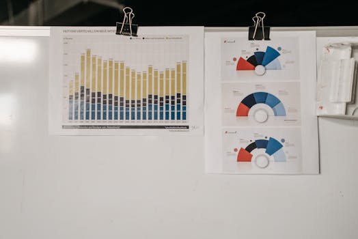
.png) Specific facts:
- The average time a reader spends looking at an email is just 10 seconds (Statista, 2023).
- 80% of readers will only scan your email, not read it word-for-word (HubSpot, 2022).
- Emails with a strong visual hierarchy have up to a 23% higher click-through rate compared to those with cluttered layouts (Litmus, 2021).
Key components of visual hierarchy in email newsletters include:
- Headings and subheadings
- Font size and weight
- Color and contrast
- Spacing and alignment
- Imagery and icons
- Placement of calls-to-action (CTAs)
Specific facts:
- The average time a reader spends looking at an email is just 10 seconds (Statista, 2023).
- 80% of readers will only scan your email, not read it word-for-word (HubSpot, 2022).
- Emails with a strong visual hierarchy have up to a 23% higher click-through rate compared to those with cluttered layouts (Litmus, 2021).
Key components of visual hierarchy in email newsletters include:
- Headings and subheadings
- Font size and weight
- Color and contrast
- Spacing and alignment
- Imagery and icons
- Placement of calls-to-action (CTAs)
Creating a Clear Path: Visual Cues That Guide Reader Attention
Every element in your email should have a purpose. Strategic placement and formatting can make the difference between a reader clicking through or hitting delete. Here’s how to use visual cues to your advantage:
1. $1: Use larger, bolder fonts for headlines. Subheadings break up content into digestible chunks. This not only helps scanners but also improves accessibility for those using screen readers. 2. $1: Colors evoke emotion and draw attention. Use a limited palette that aligns with your brand, but make sure your most important elements—such as CTAs—stand out with high contrast. For instance, a red button on a white background is more noticeable than a blue button on a blue background. 3. $1: Don’t underestimate the power of empty space. Generous padding around key elements creates breathing room and naturally draws the eye. 4. $1: Images should support your message, not distract from it. Use icons to highlight benefits or steps, and keep them consistent in style and size. 5. $1: Arrows, lines, or even the gaze of a person in a photo can subtly direct attention toward your CTA or important content.Example: A newsletter promoting a webinar might use a bold headline (“Join Our Free Webinar”), a contrasting colored button (“Register Now”), and an image of a person looking toward the CTA, all aligned in a single vertical path.
Case Study: How Visual Hierarchy Increased Email Conversions
Let’s look at a real-world example. An e-commerce company wanted to boost conversions from their monthly product launch email. Here’s what they changed:
- Original email: Cluttered with multiple products, similar font sizes, and CTAs scattered throughout. - Improved email: Featured a single hero product at the top with a large image, bold headline, brief description, and one prominent CTA button. Supporting products were listed below, in smaller sections. Results after one month: - Click-through rate increased from 3.4% to 5.9% (a 73% improvement). - Conversion rate for the featured product rose by 42%. - Average time spent reading the email grew from 8 to 13 seconds.This case demonstrates the impact of focusing attention on a single, prioritized action through visual hierarchy.
Visual Hierarchy in Action: Comparing Effective vs. Ineffective Layouts
To illustrate the difference visual hierarchy makes, consider the following comparison:
| Element | Effective Email | Ineffective Email |
|---|---|---|
| Headline | Large, bold, at the top | Small, buried in text |
| CTA Button | Contrasting color, centered, above the fold | Muted color, below main content |
| Imagery | Relevant, supports message, clear focal point | Random, decorative, distracts from CTA |
| Spacing | Adequate whitespace, easy to scan | Crowded, cluttered, hard to follow |
| Color Use | Limited palette, strategic contrasts | Too many colors, no clear emphasis |
This table makes it clear: prioritizing elements with hierarchy leads to a more engaging, actionable email.
Best Practices for Data Visualization in Newsletters
For marketers and creators, infographics and data-driven storytelling are increasingly popular in newsletters. However, even the best data loses impact without visual hierarchy.
Best practices include: - $1: Use larger fonts or bold colors for standout statistics (e.g., “73% increase in engagement”). - $1: Arrange charts, graphs, and supporting text in a logical order, from most important to least. - $1: Use icons to break up sections and create visual anchors. - $1: Ensure that graphs and charts are easy to read on both desktop and mobile; avoid overly complex designs.A study by Campaign Monitor found that emails with well-designed data visualizations saw a 48% higher engagement rate than those with text-only statistics.
Optimizing for Mobile: Hierarchy on Small Screens
With over 61% of email opens happening on mobile devices (Litmus, 2023), designing with mobile hierarchy in mind is essential. Here’s how to maintain effective hierarchy on small screens:
- $1: Place the most important information and CTA at the very top. - $1: Ensure headings and CTAs remain prominent and tappable. - $1: Limit the number of sections to avoid overwhelming users. - $1: Preview emails on both smartphones and tablets to confirm hierarchy is preserved.A mobile-friendly, hierarchical email keeps readers engaged, even in the 3–5 seconds it takes them to decide whether to continue reading or move on.
Final Thoughts: Why Visual Hierarchy Is the Secret Weapon in Email Marketing
The psychology of visual hierarchy is more than just design theory—it’s a proven, actionable strategy to boost the effectiveness of your email newsletters. By guiding your reader’s eye through thoughtful arrangement of headlines, images, colors, and CTAs, you can increase engagement, drive conversions, and create a more memorable brand experience.
In a digital landscape where attention is scarce, mastering visual hierarchy is the marketer and creator’s secret weapon. Start by auditing your current email templates, experiment with layout changes, and measure the results. The right hierarchy can turn a quick glance into a lasting connection—and a loyal customer.