Unlocking the Power of A/B Testing for Visual Email Campaigns
In the crowded world of digital marketing, capturing attention in the inbox is a constant battle. While marketers have embraced visuals, infographics, and data-driven storytelling for years, one strategy stands out for driving continuous improvement: A/B testing. By systematically testing different visual elements in your email campaigns, you can uncover surprising insights about what resonates with your audience, optimize for engagement, and boost your ROI. This article explores how to harness the full potential of A/B testing for visual email campaigns, complete with actionable steps, case studies, and practical advice for marketers and creators.
What is A/B Testing in Visual Email Campaigns?
A/B testing, also known as split testing, is a method where two versions of an email are sent to separate segments of your audience to determine which performs better. In the context of visual emails, A/B testing can compare:
- Different banner images - Infographic layouts - Button colors and placements - Visual hierarchy and flow - Chart types for storytellingThe process is simple: you change one element at a time, measure the difference in key metrics (like open rate, click-through rate, or conversion), and use the winning version in future campaigns. According to Litmus, 47% of marketers regularly use A/B testing to optimize their emails, and those who do report a 37% higher ROI than those who don't.
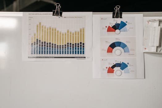
.png)
Why Visual Elements Deserve Rigorous Testing
Visuals are more than decoration—they’re strategic drivers of engagement and comprehension. However, what looks good to a design team might not actually convert. Consider these facts:
- 65% of people are visual learners, according to the Social Science Research Network. - Campaign Monitor found that emails with personalized images see a 29% higher unique open rate. - A single change in a button color or image can increase click-through rates by over 20%, as shown in a 2023 HubSpot study.Testing is crucial because audience preferences vary widely. For example, an infographic that works well for a B2B software company may fall flat for a fashion retailer. A/B testing removes guesswork, letting your actual audience determine which visuals drive results.
Key Visual Elements to Test in Your Email Campaigns
With so many possibilities, where should marketers and creators start? Here are the most impactful visual elements to test:
1. $1: The first image users see can set the tone and affect scroll depth. Test bold vs. subtle imagery, photo vs. illustration, or even no hero image versus having one. 2. $1: Does your audience prefer minimalist charts, colorful icons, or detailed process visuals? Try different infographic formats and layouts. 3. $1: Small tweaks like color, size, or shape can have outsized effects. For example, Unbounce found that rounded CTA buttons increased clicks by 12% compared to square ones. 4. $1: Compare bar charts, pie charts, or icon-based representations for the same dataset. Test which format leads to more clicks or forward rates. 5. $1: Animation can increase engagement, but it can also distract or slow load times. Test whether subtle GIFs or static images perform better.How to Run Effective A/B Tests in Visual Email Campaigns
A/B testing works best when it’s methodical and data-driven. Follow these steps to ensure actionable results:
1. $1: Are you aiming for higher open rates, more clicks, or increased conversions? The goal determines what you test and how you measure success. 2. $1: Split your audience into two random, equal groups to avoid bias. For statistically significant results, aim for at least 1,000 recipients per variant if possible. 3. $1: To isolate the effect, only test one visual element per experiment. If you change the hero image and the CTA color simultaneously, you won't know which caused the difference. 4. $1: Use your email platform’s analytics to measure open rate, click-through rate, click-to-open rate, and conversions. 5. $1: Look for statistically significant differences, not just small fluctuations. Apply the winning variant in future campaigns and continue testing new elements.| Visual Element | What to Test | Potential Impact |
|---|---|---|
| Hero Image | Photo vs. Illustration | Up to 15% increase in scroll depth |
| CTA Button | Color, Shape, Size | 12-20% increase in click-through rate |
| Infographic Layout | Minimalist vs. Detailed | 8-14% higher comprehension |
| Animation | GIF vs. Static | 10% increase or decrease in engagement |
Real-World Examples of Visual A/B Testing Success
Many brands have uncovered surprising wins through visual A/B testing. Here are a few notable examples:
- $1 ran a test on their year-end fundraising email: version A used a heartfelt photo, while version B used a bold, data-driven infographic. The infographic version increased donations by 22% compared to the photo. - $1 tested animated versus static header images in their creator newsletter. The animated version increased click-through rates by 11%, but only for their under-30 audience segment. - $1 experimented with the color and shape of their CTA button. Switching from blue rectangular buttons to green rounded buttons boosted click-through rates by 16%, aligning with their brand’s friendly, approachable image.These results highlight the importance of not relying on assumptions. What works for one brand—or even one segment of your audience—might not work for another.
Common Pitfalls and How to Avoid Them
While A/B testing is a powerful tool, there are common mistakes that can undermine your efforts:
1. $1: This leads to inconclusive results. Always test one visual element per experiment. 2. $1: Small audiences can produce misleading data due to random chance. Use a sample size calculator to determine the minimum recipients needed for statistical significance. 3. $1: Don’t jump to conclusions based on small differences. Use a tool or calculator to ensure your results are valid. 4. $1: A/B testing should be ongoing. Audiences evolve, and what works now may not work next year.By avoiding these pitfalls and sticking to a disciplined testing process, you can build a visual email strategy that’s always improving.
Final Takeaways: Building a Culture of Visual Experimentation
A/B testing is more than a one-time tactic—it’s a mindset of curiosity and continuous improvement. For marketers and creators who routinely send visual emails, A/B testing unlocks deeper audience insights, higher engagement, and better business outcomes. By embracing this data-driven approach, you can move beyond design trends and personal preferences, making every visual element in your emails work harder for your goals.
Invest in a systematic A/B testing process, document your findings, and share insights across your marketing team. Over time, you’ll build a powerful, evidence-based playbook for visually compelling, high-performing email campaigns.