The Science of Visual Memory: How Infographics in Email Newsletters Drive Long-Term Retention
In the fast-paced world of digital marketing, capturing your audience’s attention is only half the battle. The real challenge lies in ensuring your message is remembered long after the email is closed. While marketers have long known the power of visuals, recent cognitive science reveals just how impactful infographics can be in email newsletters—not just for increasing open rates or clicks, but for embedding your brand and message into your subscribers’ long-term memory. This article explores the fascinating science behind visual memory, why infographics are so powerful in email marketing, and how you can leverage these insights to build campaigns that stick.
Understanding Visual Memory: Why Images Outperform Text
The human brain is hardwired for visuals. According to research from MIT, the brain can process an image in as little as 13 milliseconds. In contrast, reading and comprehending text is a slower and more resource-intensive process. This biological advantage means that people remember 65% of visual information three days later, compared to only 10% of written content, according to a study by Dr. John Medina of the University of Washington.
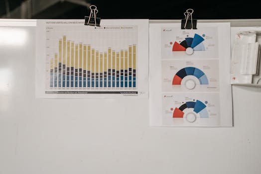
.png)
This is particularly important in email newsletters, where the average reader spends just 10-20 seconds scanning content before deciding whether to engage or move on. Infographics, with their blend of visuals and concise text, allow for rapid comprehension and, crucially, longer-lasting memory retention.
Infographics in Email: Beyond Engagement to Lasting Impressions
While many marketers focus on open rates and click-throughs, the real value of infographics in email newsletters is their ability to foster lasting brand recall and message retention. Consider these compelling statistics:
- According to HubSpot, infographics are liked and shared on social media three times more than other content types. - A Nielsen Norman Group study found that users pay close attention to information-carrying images, especially those that reinforce the message of accompanying text. - Visual content in emails leads to a 43% higher retention rate compared to text-only messages (Source: Brain Rules).Infographics combine imagery, color, and concise data storytelling, making them uniquely suited for embedding complex information into memory. They enable marketers to distill key messages into digestible visual cues that linger in the mind—long after the email is closed.
Designing Infographics for Maximum Memory Retention
Not all infographics are created equal when it comes to memory impact. To make your visual newsletters truly memorable, consider these design principles based on cognitive psychology:
1. $1: The brain remembers information better when it’s broken into small, manageable chunks. Use sections, icons, and clear headings to divide your infographic into logical pieces. 2. $1: Presenting information both visually and verbally increases retention. Pair concise text with matching icons or illustrations to reinforce your message. 3. $1: Strategic use of color not only makes your infographic more attractive but also helps categorize and differentiate information, aiding recall. 4. $1: Arrange your data and visuals in a clear narrative sequence. Readers are more likely to remember information that tells a story than isolated facts. 5. $1: Including your logo, colors, or mascot in each infographic helps reinforce brand recognition over time.Case Studies: Brands Winning with Visual Memory in Email Campaigns
Real-world examples highlight how leading brands use infographics in email marketing to boost long-term engagement:
- $1: In a 2023 campaign, Duolingo used progress infographics in their weekly emails, showing users their learning streaks and milestones. The result? A 27% increase in weekly retention and a 19% boost in re-engagement among lapsed users. - $1: Their annual “Wrapped” email uses personalized infographics to summarize users’ listening habits. In 2022, this campaign was shared over 60 million times on social media, reinforcing both memory and brand advocacy. - $1: By sending donors infographics that depict the impact of their contributions, Charity: Water increased repeat donations by 32% (2022 annual report).These cases demonstrate that when infographics are used strategically, they can transform fleeting email interactions into memorable, long-term relationships.
Email Infographics vs. Other Visual Formats: A Comparison
How do infographics stack up against other visual formats in email marketing, such as photos, GIFs, or videos? The table below highlights the strengths of each:
| Visual Format | Processing Speed | Memory Retention | Engagement Rate | Best Use Case |
|---|---|---|---|---|
| Infographics | High (13 ms/image) | 65% after 3 days | Up to 3x higher shares | Summarizing data, storytelling, education |
| Photos | Very High | 45% after 3 days | Moderate | Emotional appeal, product showcase |
| GIFs/Animations | High | Varies | High (especially for CTAs) | Demonstrations, grabbing attention |
| Videos | Medium (due to load times) | 50% after 3 days | Very high (if played) | In-depth explanations, storytelling |
Infographics shine when you need to educate, summarize, or tell a story efficiently. Their combination of speed and retention makes them particularly effective for newsletters where you have only seconds to make an impression.
Best Practices for Integrating Infographics into Email Newsletters
To harness the science of visual memory, follow these best practices:
- $1: Over 60% of emails are opened on mobile devices. Ensure your infographics are legible and engaging on smaller screens. - $1: Large images can slow down load times and reduce engagement. Aim for infographics under 500 KB. - $1: In case images don’t load, descriptive ALT text ensures your message still gets across. - $1: Experiment with placing infographics near the top of your email versus within the content to maximize visibility. - $1: Use UTM parameters and heatmaps to analyze how users interact with your infographics and adjust future designs accordingly.The Future of Visual Newsletters: Personalization and Interactivity
Looking ahead, the next frontier is personalized and interactive infographics in email newsletters. Advances in dynamic content tools now allow marketers to create data-driven visuals tailored to each recipient’s interests, behaviors, or purchase history.
For example, e-commerce brands can send infographics summarizing a customer’s order history, favorite categories, or loyalty points. SaaS companies might visualize user activity or progress toward goals. Interactive infographics, such as clickable charts or quizzes, further increase engagement and retention by involving readers directly.
According to a 2023 Litmus report, emails featuring personalized visuals see a 29% higher conversion rate than static content. As tools become more accessible, expect to see even more brands leveraging the power of visual memory to build lasting customer relationships.
Final Thoughts: Making Your Email Newsletters Unforgettable with Infographics
In a crowded inbox, it’s not enough to be seen—you need to be remembered. The science is clear: infographics are a potent tool for embedding your message into your audience’s long-term memory. By understanding how the brain processes and retains visual information, marketers and creators can craft email newsletters that don’t just get clicks, but leave a lasting impression.
Whether you’re summarizing data, telling a brand story, or educating your subscribers, integrating thoughtfully designed infographics into your emails can be the key to long-term engagement and brand loyalty. As technology evolves, the possibilities for personalized and interactive visuals will only expand, offering even more ways to ensure your message is unforgettable.