Ultimate Guide to Mastering Email Marketing: Visual Newsletters, Infographics, and Data-Driven Storytelling
Welcome to your one-stop resource for mastering email marketing, designed specifically for marketers and creators who want to captivate their audience and drive results. In the digital age, email remains a powerful tool for building relationships and delivering targeted content directly to your subscribers. By leveraging visual newsletters, infographics, and data-driven storytelling, you can elevate your email campaigns and stand out in a crowded inbox. Here’s how you can make the most of these strategies:
Visual Newsletters: Capturing Attention in an Instant
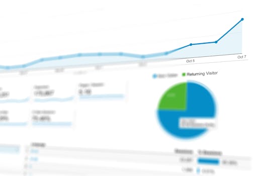
.png)
Why Visual Newsletters? Visual content is 40 times more likely to get shared on social media than other types of content. Incorporating visually appealing elements in your newsletters not only grabs attention but also enhances the user experience and increases engagement.
How to Create Visual Newsletters:
- Layout and Design: Use clean, attractive layouts that guide the reader’s eye through the content. Tools like Canva and Adobe Spark offer user-friendly design options.
- Images and Videos: Include high-quality images and videos to break up text and add interest. Make sure they are relevant and add value to the content.
- Typography: Choose fonts that are easy to read and make important information stand out.
- Color Scheme: Use colors that reflect your brand and help to highlight key areas of your newsletter.
Infographics: Simplifying Complex Information
Benefits of Infographics in Email Marketing: Infographics can transform complex data into easy-to-understand visuals that communicate key messages succinctly. They are especially useful for summarizing reports, illustrating trends, or explaining processes.
Tips for Crafting Effective Infographics:
- Focus on Data: Start with reliable data. Use it to tell a story or highlight important trends.
- Keep it Simple: Clarity is crucial. Don’t overcrowd your infographic with too much information.
- Use Tools: Platforms like Piktochart or Venngage are great for creating professional-looking infographics.
- Make it Shareable: Ensure your infographics are optimized for sharing and include your logo to boost brand visibility.
Data-Driven Storytelling: Engaging Audiences with Stories
The Power of Storytelling: Stories have the power to connect emotionally with audiences, making your message more memorable. Data-driven storytelling combines narrative and data, presenting a compelling story backed by evidence.
How to Implement Data-Driven Storytelling:
- Gather Data: Use analytics tools to collect data that supports your message.
- Identify Key Points: What’s the narrative? What data points help tell this story?
- Structure Your Story: Begin with a hook (a compelling point or question), present the data, and conclude with a call to action.
- Visualize Data: Use charts, graphs, and timelines to illustrate your points clearly and effectively.
Best Practices for Email Marketing Campaigns
- Segment Your Audience: Tailor your content to different segments based on their preferences and behaviors.
- Test and Optimize: Use A/B testing to find out what works best and refine your strategies accordingly.
- Mobile Optimization: Ensure your emails look great on mobile devices.
- Monitor Performance: Track open rates, click rates, and conversions to measure the success of your campaigns.
By integrating these elements into your email marketing strategy, you can enhance the effectiveness of your campaigns and build stronger connections with your audience. Remember, the key is to be consistent, stay creative, and always aim for clarity and value in your communications.