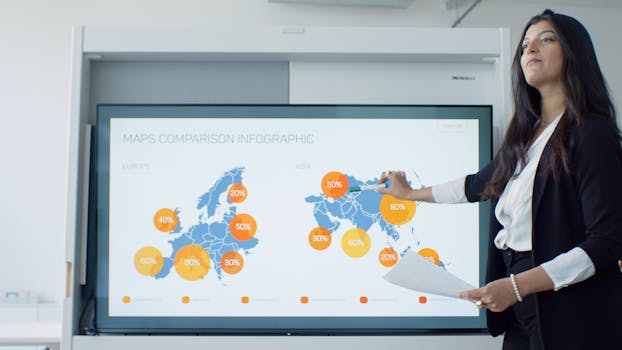
Unleashing the Power of Visual and Data-Driven Email Marketing
In today's digital age, email marketing continues to be a powerful tool for marketers and content creators to engage with their audiences. However, the key to successful email campaigns lies not just in the messages themselves, but in how these messages are visually presented and supported by data. This guide explores the essential elements of creating effective visual newsletters, using infographics, and leveraging data-driven storytelling in email marketing.
Why Focus on Visual Newsletters and Infographics?
.png)
Capture Attention: In an inbox filled with text-heavy emails, visual elements like images, infographics, and well-designed layouts can grab the attention of your recipients, making your message stand out.
Boost Comprehension: Visuals help simplify complex information, making your content easier to understand and quicker to digest. Infographics, for example, can effectively summarize key points, statistics, or trends that might take paragraphs to explain.
Enhance Engagement: Emails that include attractive visuals and infographics tend to have higher engagement rates, including click-throughs, shares, and replies. Visuals invoke emotional responses and can significantly influence user behavior.
Best Practices for Visual Newsletters
- Consistent Branding: Ensure that your newsletters consistently reflect your brand's fonts, colors, and style. This not only reinforces brand recognition but also assures your audience of the email's authenticity.
- Responsive Design: With the increasing use of mobile devices to check emails, it's crucial that your newsletters look good on all screens. Responsive design adjusts the layout based on the size of the screen, improving readability and user experience.
- Balance Text and Images: While visuals are critical, the balance of text and imagery is key. Too many images can distract and detract from the main message, while too little can make the email less engaging.
Leveraging Data-Driven Storytelling
Data-Driven Decisions: Use data to inform the content of your newsletters. Analyze what topics, styles, and types of content generate the most engagement, and tailor your strategy accordingly.
Tell a Story with Data: Use data visualization to tell a story. For instance, if you’re discussing market trends, an infographic can help illustrate changes over time, predict future trends, and explain why these changes matter.
Segmentation and Personalization: Use data about your audience to segment them into different groups based on their preferences, behaviors, and demographics. Personalized emails can significantly increase open and click-through rates.
Tools and Resources
- Design Tools: Use tools like Adobe Spark, Canva, or Piktochart to create eye-catching graphics and infographics without needing extensive graphic design skills.
- Email Marketing Platforms: Platforms like Mailchimp, Constant Contact, and Campaign Monitor offer templates and tools to create visually appealing and responsive newsletters.
- Analytics Tools: Tools like Google Analytics and built-in analytics features in email platforms can provide valuable data on how your emails are performing.
Conclusion
Incorporating visual elements and data-driven insights in email marketing can dramatically enhance the effectiveness of your campaigns. By focusing on creating visually appealing newsletters, utilizing infographics for clearer data presentation, and employing data-driven storytelling, marketers and creators can better communicate with their audiences and achieve higher engagement rates. Remember, the ultimate goal is to deliver value that resonates with and is relevant to your audience, using every tool at your disposal to make that communication as impactful as possible.


