Leveraging Data Visualization in Email Marketing: Transforming Raw Data into Actionable Insights
Email marketing has come a long way from simple text-based messages. Today’s marketers are harnessing the power of data visualization to captivate audiences, convey complex information quickly, and drive engagement. With inboxes overflowing and attention spans shrinking, the ability to turn raw data into compelling visual stories can set your email campaigns apart. This article explores how data visualization is revolutionizing email marketing, practical strategies for implementation, real-world case studies, and the best tools to get started.
The Power of Data Visualization in Email Marketing
In the digital age, data is everywhere. The challenge for marketers isn’t collecting information—it’s presenting it in a way that’s both meaningful and memorable. According to a 2023 Nielsen Norman Group study, visual content is processed 60,000 times faster by the human brain than text, making data visualization a crucial asset in email marketing.
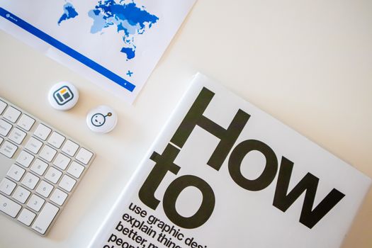
.png)
Data visualization refers to the graphical representation of information and data. By using elements like charts, graphs, maps, and infographics within emails, marketers can:
- Simplify complex data for diverse audiences - Highlight key trends or metrics at a glance - Encourage interaction and deeper engagement - Improve retention of informationFor example, instead of sending a lengthy report on campaign performance, an email featuring a simple line graph showing month-over-month growth can instantly communicate success and drive further action.
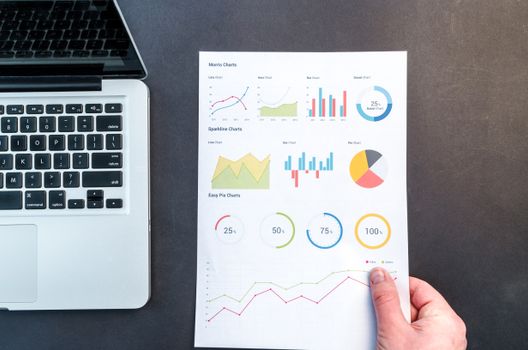
Types of Data Visualizations That Work Best in Emails
Not all visualizations are created equal, especially when it comes to the unique constraints of email. It’s important to select the right format to match your message and audience. Here are the most effective types for email campaigns:
1. Bar and Column Charts: These are perfect for comparing categories, such as product sales across regions. They’re easy to read even on mobile devices. 2. Line Graphs: Ideal for displaying trends over time, such as subscriber growth or open rates. 3. Pie Charts: Useful for showing proportions, like the breakdown of customer demographics. 4. Heat Maps: Great for visualizing engagement, such as which areas of your newsletter receive the most clicks. 5. Icon Arrays: Use small icons to represent quantities, making statistics more relatable (e.g., 1 icon = 10 customers). 6. Progress Circles or Gauges: Excellent for showcasing progress toward goals, like fundraising campaigns or challenges.A 2022 Litmus survey found that emails featuring visual data elements saw a 21% higher click-through rate compared to those with plain text statistics.
Best Practices for Including Data Visualizations in Newsletters
To maximize impact and ensure your visuals don’t get lost—or worse, go unread—follow these email-specific best practices:
- Keep It Simple: Visualizations should clarify, not confuse. Use minimal text and avoid clutter. - Optimize for Mobile: Over 61% of emails are now opened on mobile devices (Statista, 2024). Use visuals that resize well and remain legible on small screens. - Use Alt Text: Always provide descriptive alt text for images to ensure accessibility and maintain messaging if images fail to load. - Brand Consistency: Stick to your brand’s color palette and fonts to reinforce recognition. - File Size Matters: Large images can increase load times or trigger spam filters. Compress images and use formats like PNG or SVG for clarity and efficiency. - Highlight Key Takeaways: Use callouts or annotations to draw attention to the most important insights within your visuals.Real-World Examples: Data Visualization in Action
Case studies demonstrate the tangible impact of incorporating data visualizations into email campaigns:
1. SaaS Company Quarterly Reports A leading SaaS provider replaced their traditional quarterly email reports with interactive dashboards and charts. Result: a 38% increase in click-through rates and a 50% boost in replies from account managers, proving that clients engaged more when data was visual. 2. Nonprofit Fundraising Progress A nonprofit organization used progress circles in weekly donor emails to show funds raised toward a campaign goal. This simple visualization led to a 27% higher donation rate compared to campaigns without any visual progress indicators. 3. E-commerce Personalized Insights An online retailer sent personalized emails featuring bar charts showing individual spending trends and product preferences. Customers spent, on average, 18% more in the following month after receiving their personalized visual summaries.Top Tools for Creating Data Visualizations for Email
Several tools can help marketers create effective data visualizations suitable for email newsletters. Here’s a comparison of popular options:
| Tool | Main Features | Best For | Pricing |
|---|---|---|---|
| Canva | Templates for charts, infographics; easy drag-and-drop interface | Quick, visually appealing graphics | Free and Pro plans ($12.99/mo) |
| Piktochart | Infographics, reports, charts; customizable designs | In-depth storytelling visuals | Free and Pro plans ($29/mo) |
| Venngage | Data-driven infographics, charts, maps | Marketing and business analytics | Free and Premium plans ($19/mo) |
| Google Charts | Interactive charts, embeddable in emails (as images) | Live data representation | Free |
| Flourish | Advanced data visualizations, interactive features | Complex datasets, storytelling | Free and Pro plans ($55/mo) |
When selecting a tool, consider your team’s design skills, data complexity, and how much customization you require.
Measuring the Impact of Data Visualization in Email Campaigns
Implementing visualizations is only half the battle. Measuring their effectiveness is crucial to refining your strategy and proving ROI. Key performance indicators (KPIs) to track include:
- Open Rates: Do emails with data visuals have higher open rates? - Click-Through Rates (CTR): Are subscribers engaging more with emails that feature charts or infographics? - Conversion Rates: Does presenting data visually influence purchases, sign-ups, or donations? - Time Spent: Are readers spending longer on emails with engaging visuals? - Heat Maps: Which visual elements attract the most clicks or interactions?According to Campaign Monitor (2023), marketers who regularly include data visualizations in their emails report a 24% increase in overall campaign engagement compared to those who do not.
Use A/B testing to compare performance between emails with and without data visualizations. This approach helps you understand which formats resonate best with your audience and how to optimize future campaigns.
Future Trends: Interactive and Real-Time Data Visualizations
As technology evolves, so do the possibilities for integrating data visualization into email marketing. Some forward-thinking trends to watch include:
- Interactive Visuals: HTML5 and AMP for Email now allow subscribers to interact with charts—hovering, filtering, or drilling down for more details—without leaving their inbox. - Real-Time Data: Embedding live data (like sales numbers or event registrations) that updates automatically each time the email is opened. - Personalized Data Stories: Using AI and automation to generate unique data visualizations for each subscriber, based on their behavior or preferences.Brands adopting these advanced techniques are seeing even higher engagement and conversion rates, as subscribers receive value-rich, tailored content that feels both relevant and dynamic.
Final Thoughts on Harnessing Data Visualization for Email Marketing Success
Data visualization isn’t just a design trend—it’s a strategic tool that can dramatically boost the clarity, appeal, and effectiveness of your email marketing. By transforming raw numbers into compelling visual narratives, marketers can cut through the noise, communicate complex information instantly, and drive measurable results.
With the right approach, tools, and ongoing measurement, integrating data visualizations into your email campaigns can lead to higher engagement, stronger subscriber relationships, and a better return on investment. Start experimenting with simple charts or infographics, then advance to interactive and personalized visuals as you grow more comfortable. As inbox competition intensifies, those who master data-driven storytelling will have the strongest voice.